Cesure
A featured work in the Noctuelles portfolio by Orihaus.
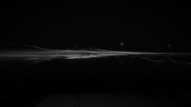
Cesure is one of the creative projects housed within the Noctuelles portfolio. It sits alongside works such as Lumiere and For Each Our Roads of Winter, reflecting the site's broader exploration of interactive environments, visual design, and experimental digital art.
Further details about Cesure are available through the main Noctuelles site and its collection of project pages.
Cesure sits within a portfolio that moves between light and shadow, much like the site itself. The upper pages carry an off-white calm, while the deeper sections descend into near-black atmospheres punctuated by dusty rose, olive, and gold. This visual arc mirrors the project's own concerns — a pause, a break, a moment of rupture in an otherwise continuous surface. The work explores how interactive environments can hold tension, how a single cut in a narrative can reframe everything around it. It is the kind of piece that rewards slow attention, where each layer of texture and tone asks the visitor to linger rather than rush past.
The typographic language surrounding Cesure is deliberate and modern, with heavy geometric headlines set against lighter body copy and small uppercase labels that function as quiet signposts. This contrast between weight and air echoes the thematic tension at the heart of the project — the heavy and the fleeting, the permanent and the fragile. Like other works in the Noctuelles collection, Cesure treats the screen as a canvas for experimental storytelling, weaving procedural materials and subtle motion into something that feels both crafted and alive. The result is an experience that reads less like a conventional webpage and more like a slow, contemplative object.
Within the broader Noctuelles universe, Cesure shares kinship with works that explore memory, pain, and the passage of time — themes that recur across the site's project pages and its more personal writing. The name itself suggests a break, a seam, a place where something stops and something else begins. That threshold quality is present throughout the design, from the shifting palettes to the layered organic textures behind the text. Cesure does not announce itself loudly; it waits, inviting the visitor to step across the threshold and discover what lies on the other side of the cut.